It matters how it looks
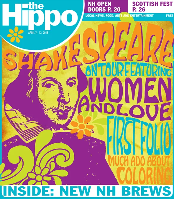
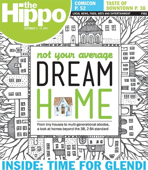
The look and feel of Hippo is as important as the content. In fact, the two are linked. We couldn't imagine a great television show that was poorly shot, nor can we imagine a compelling print publication that is poorly designed.
We use design as a way to draw readers in, and then keep them. Good design needed to help readers navigate the pages, also creates a brand itself. Are the fonts and typography modern, or do they remind readers of a time before digital?
We feel strongly that design is a key element in attracting readers. We've found that to be true in the covers of each edition. For example, bright colors attract a higher pickup than darker, more muddy images. We might have guessed that, but we went a step further an use our returns data to measure and confirm it.
So we spend a lot of time creating each cover, making sure that it clearly communicates with potential readers, is easy to understand and is innovative and creative.
Readers expect more in the digital age. Hippo delivers that, which is one reason circulation and readership of our print product continues to grow.


